Saturday, November 29, 2008
Wednesday, November 12, 2008
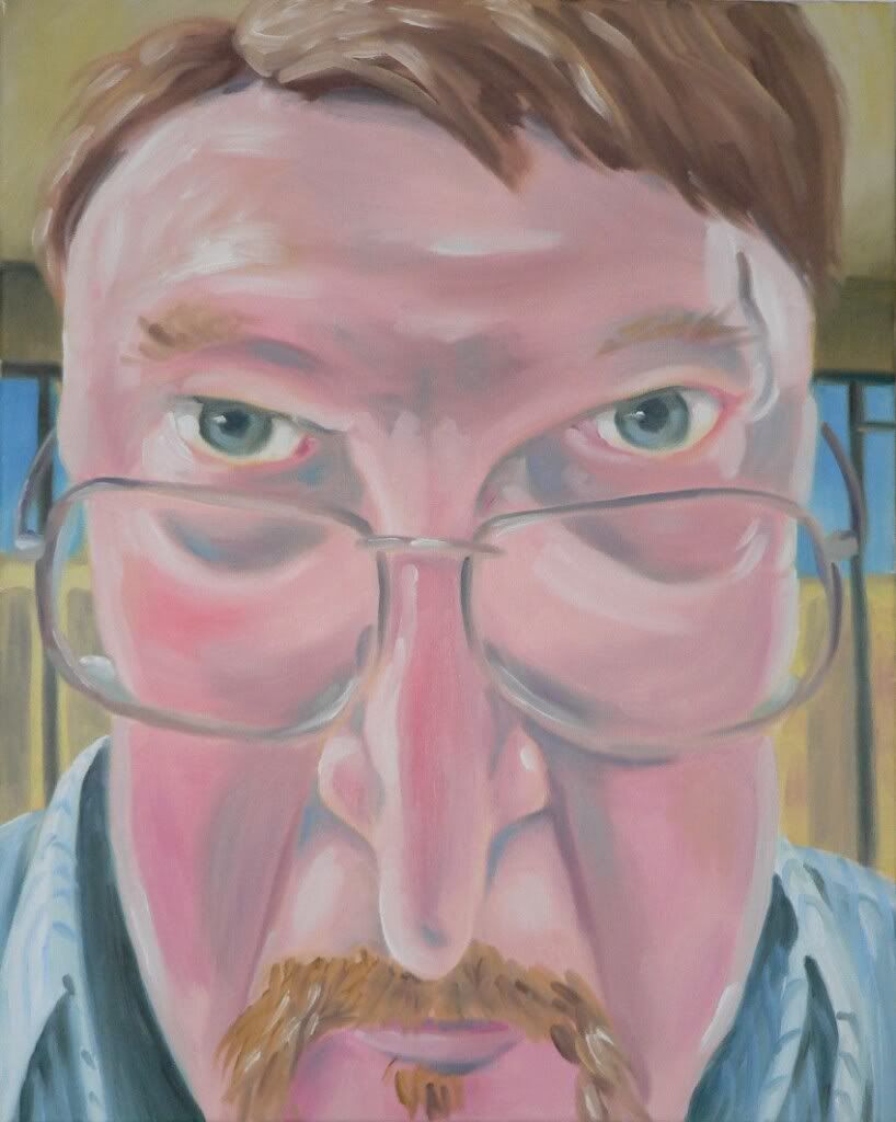
The List

The List
16 x 20 inches
acrylic on canvas
acrylic on canvas
This painting was finished on November 11, 2008 to be included in an upcoming show. I will be the featured artist for the month of December at Barnes and Nobles Booksellers on Miamisburg- Centerville Rd. (the Dayton Mall location). I wanted to do a traditional Santa portrait based on my childhood memories. My version is less 'jolly old elf' and more grandfatherly in nature. I have several other Santa paintings to include in this show as well as winter landscape paintings and photographs.
Tuesday, October 28, 2008
squash bouquet
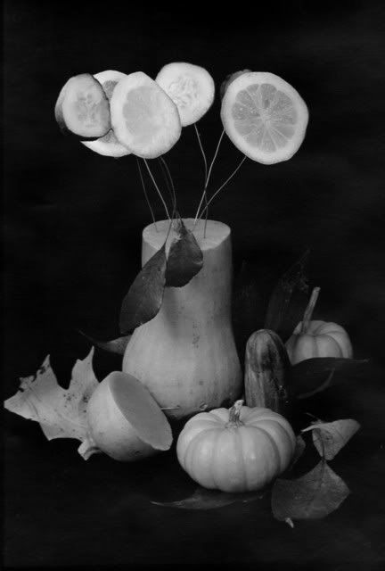
Squash Bouquet
12 x 15 silverprint b/w photograph
12 x 15 silverprint b/w photograph
This is part of a series of black and white photos that I did with an autumn theme. I wanted to do something seasonal yet with a twist. So I took the usual floral and still life and combined them using the popular fall vegetables such as butternut squash, zucchini and a small pumpkin (and a cucumber which found it's way in somehow). This photo was taken on 100 iso Kodak T Max film with a Nikon N 65 camera. Developed in Dektol and printed on Ilford fibre paper.
Sunday, October 26, 2008
Like Soldiers in the Sun
 Like Soldiers in the Sun
Pastel on Museum Board
15 x 20 inches
This piece is based on a photograph I took in the Oregon District of Dayton Ohio on a sunny late afternoon. I was drawn by the way the boxes were in such a perfect line and standing motionless in the bright light. the legs seemed to give them a living quality which made it feel as though they should be walking to the shadier side of the building for some relief from the heat. The photograph reminded me of the work of Edward Hopper, so I wanted to replicate some of the aspects of his paintings in my drawing. I feel that this is accomplished by the flatness of the color planes and the stark sense of lights and darks.
Monday, July 7, 2008
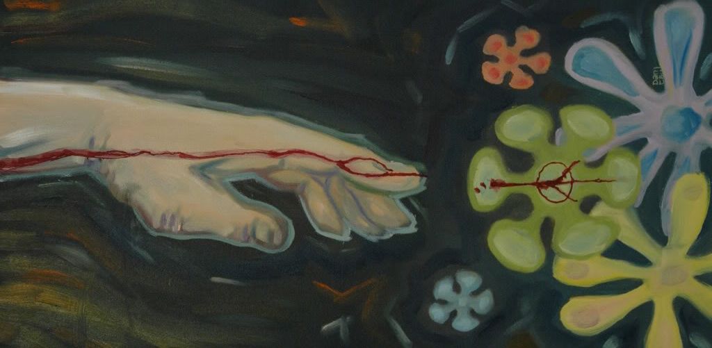
Freedom From Speech
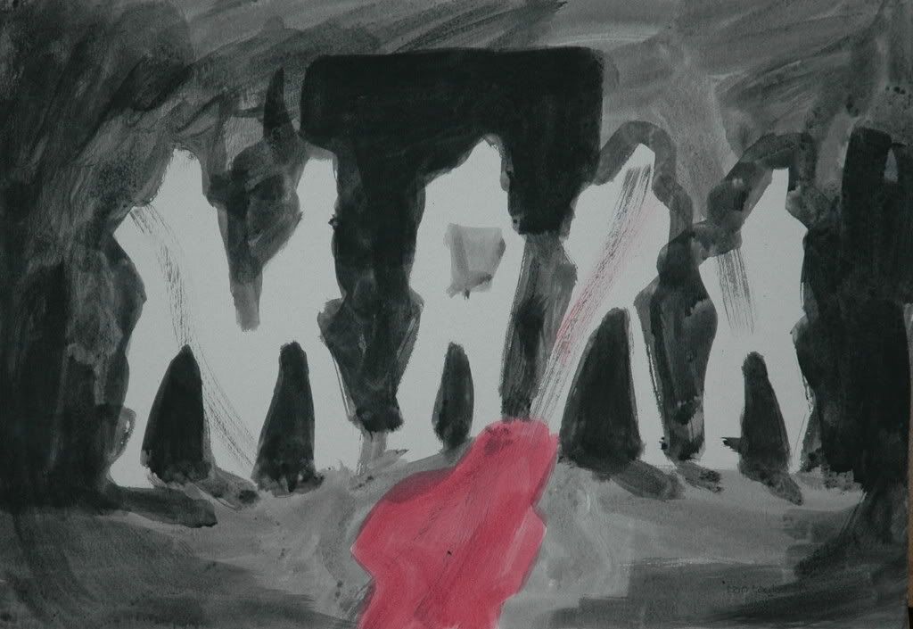 Freedom From Speech
18 x 24 inches
Ink wash on museum board 2008
This work is based on the 2002 beheading of journalist Daniel Pearl by al-Qaida operative Khalid Sheikh Mohammed. The photos and subsequent remorseless confession by Khalid reinforce to me the price of our first amendment and truly what a powerful tool it is. How diligently it needs to be protected and maintained.
The medium is Higgins black magic india ink and Higgins drawing ink (Red) applied in broad gestural strokes with the dark areas being built up through layers and increasing the amount of pigment in the wash. The red wash was applied last to bring it more to the forefront via the overlapping areas of the image. A drybrush 'swash' of dirty black / red mix is meant to reference the blood spray at the moment of execution.
As always, I welcome and appreciate any comments on the artwork.
Thursday, July 3, 2008
Peace From Above
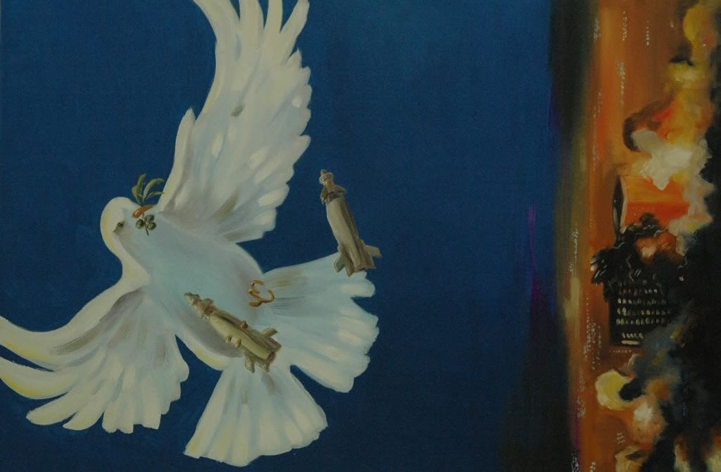 Peace From Above
Oil and Acrylic on canvas
24 x 48 inches. 2008
Another 'statement' piece, I attempt to illustrate the principal of the price that peace can require. The dove, complete with olive branch, drops the Paveway smartbombs upon some nameless city requiring 'cleansing' to enforce the idea of peace.
The blue background on this painting is a metallic acrylic that positively glows under the light. It's a shame that the full effect is lost in the photograph. This causes the dove to pop off of the picture plane giving it a great 3D appearance.
As a side note, this painting was displayed at a local show. At the opening reception, I noticed one man in particular paying close attention to the dove's armament. Upon talking to him, I find that he was on the team of engineers that designed the guidance system for the bombs!
Wednesday, July 2, 2008
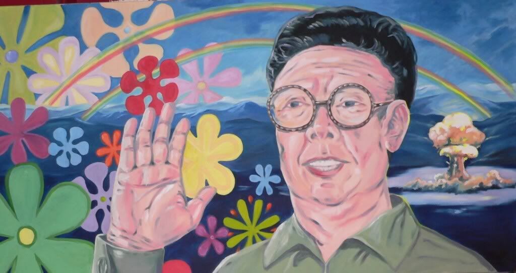
New Art! Noble Peace Price
 Noble Peace Price
Oil on Canvas
15 x 30 inches 2008
This piece was created to further reinforce the imagery which shows that peace is often purchased with blood. I wanted to reference the war posters of the 1960's and 70's in a way that was, at once, direct. But at the same time, I wanted to leave no doubt that this image is from the present day. I try to accomplish this with the retro floral motif but with a modified color palette that would be different from the popular color schemes of 40 years ago.
Response to April 15th
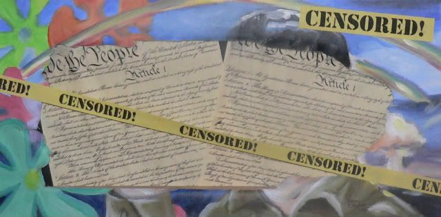 Because I Can!
Mixed Media on Canvas
10 x 20 inches
This painting is in response to the censoring of my large scale painting. See my April 15th blog entry for the full story. This piece was created to display in the place of the piece that was removed from my showing, but the gallery managers asked that I not hang this piece either!
Catching up.

I wanted to take a bit of time to post several paintings from the last year to get things caught up. I've got several new paintings currently in various stages of completion which I'll post soon! I would be grateful to receive any commentary or critique on these works.
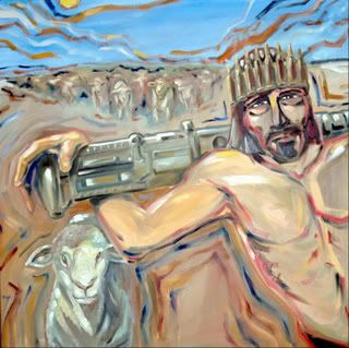 The Good Shepherd
 Oil on canvas 36 x 36 inches
Tuesday, May 13, 2008
Sideshow 3! This weekend!

This weekend celebrates the 3rd incarnation of the Sideshow. The arts fest presented by the Circus Creative Collective in conjunction with Dayton's Urban Nights festival. I've created 3 new paintings which will be unveiled at this show and posted here soon after.
Tuesday, April 15, 2008
Dismay
Something happened today that I don't fully understand...
Over the past weekend, I installed several of my paintings at a local gallery that was kind enough to invite me to be a guest artist. Today, I received a call from the gallery manager. Apologizing profusely, she informed me that she had to remove the above painting from the display. She said that the management of the mall had received several complaints about this work. She didn't know the exact nature of the complaint but since the mall has graciously donated the space to the gallery, she felt compelled to remove it ( I understand her reasons completely). The only issues listed in the prospectus and gallery rules concern nudity or violence. Neither of which are present in this work. In fact, I would consider this work pretty far down the list of possibly controversial paintings in this installation. I took special care and did a great deal of research for this painting in the attempt to make it politically neutral. Just based on fact and image as presented by the subject without taking a personal stance. I am baffled. Especially since the complaints seem to have come from several sources.
I am asking that anyone who may know why someone would be vehemently against the display of this painting, please comment here and let me know. Or email me directly at weirdmuse (at) gmail.com . Thank you.
Thursday, April 10, 2008
Saturday, February 16, 2008
Dad's Buddy, Ashley
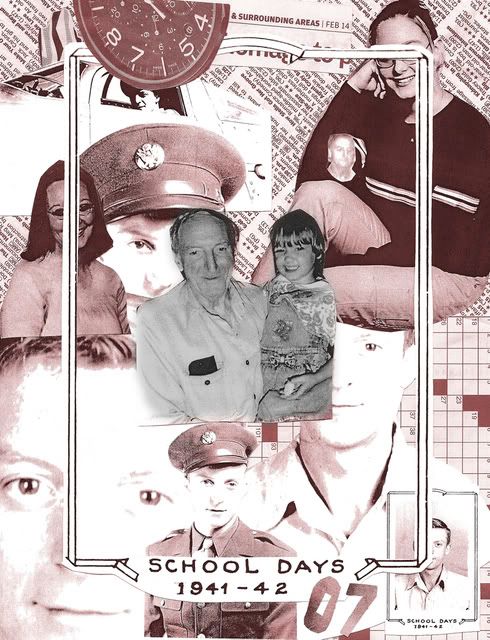
Dad's Buddy, Ashley
Collage
8 1/2 x 11 in.
2008
While rummaging through some family photos, I came across a photo of my father and my niece, and I was struck by the realization that in the photos they were the same age. My father died when my niece was very young. He had Alzheimer's disease but always seemed to recognize and take great joy from her. Even as his memory degenerated near the very end of his life, he would always brighten up whenever he saw her. Upon further digging through the photos I found one of my father holding a very young Ashley not long before his death.
I wanted to create the sense of the time-line that connects these 2 people who were very important to each other and also very important to me. I used xerox copies of the photographs so I could control the contrast and scale of the individual images. The lighter copies appearing 'ghost-like' as to indicate that the subject had passed on to another form of existence. Frozen in time, the clock which overlaps the interior frame references the time that has passed since my father was 18 (as in his Army photo) and my niece turned 18 (her senior photo in the upper corner). I also incorporated several other items such as the newsprint and crossword puzzle to add a sense of space to the works. I feel that the text conveys the feeling that there is more information here than you could take in at first glance. That it would take an investment of time to get the full measure of the meaning of the relationship being depicted. Much like reading a newspaper takes more of a personal investment than watching a news blurb on the television.
The original, being made of photocopies and newspaper, is not archival, so I scanned it to be able to produce archival prints. After scanning I colorized the entire collage in a sepia tint except for the central image which I left as black and white. I think that by doing this it keeps this moment in time fresh and in the present. Where I sometimes wish it was.
Monday, February 4, 2008
Bob, meet Jim.
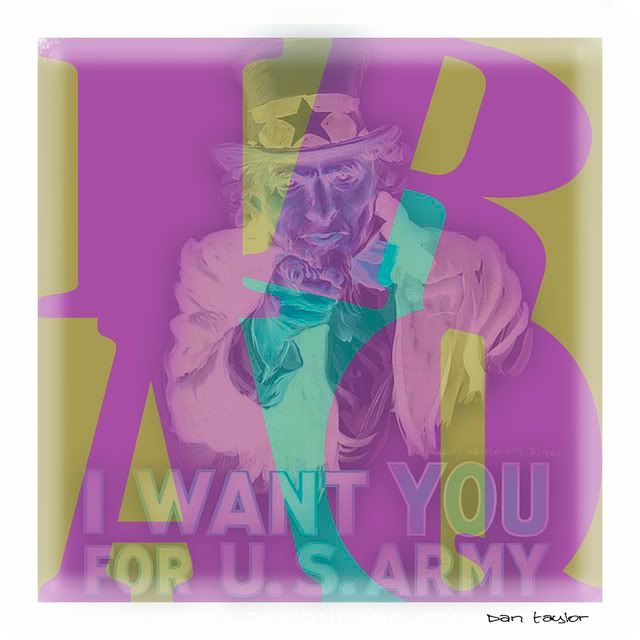 Bob, Meet Jim.
12 x 12 inches. 2007
Illustration and photo-manipulation
This work references Robert Indiana's iconic pop art print of the 1960's featuring the 4 letters of the word 'love'. Overlaying this is a manipulation of the classic James Montgomery Flagg recruitment poster. I wanted to bring out several emotions at once with this piece. I use the Indiana reference to imply the 1960's and the relation and similarities of the war in Iraq with the war in Vietnam. But at the same time I wanted to reference the poster from World War 2 and the feeling of a more 'justified' war. The figure of uncle Sam is reversed to it's negative to add a ghost-like appearance which, I think adds to the sense of unease as though the victims and heroes of these wars were judging what was happening with the war today. I also use a tertiary color scheme to add in the unnerving effect of the work. This was originally done as a prelude to a painting but upon completing this reference, I think everything that I would say with the painting has been communicated with this piece.
Subscribe to:
Posts (Atom)