Artist Statement
I’m not a painter…
In spite of the fact that you are viewing many of my works, which are primarily created using oil paints, I don’t consider myself a painter. I think of myself as a communicator, like a speechwriter, newspaper reporter, orator, or even in some aspects, a politician. I compose my ideas and try to present them in a manner that others can experience the way I feel while creating the composition. But where a speechwriter or reporter uses words to ply their trade, I am an artist, therefore I use the language of imagery to state my feelings and opinions. This imagery may vary from photography, to painting with realism, to figurative abstract, or even involve elements of found-object collage and assemblage. It may also vary from simple emotions like joy and contentment to more complex feelings such as fear, love and sadness. It is the process of communicating my ideas that is important more than the media used. In fact, it is the creative process of the communication that is important to me. While I am working on a piece, I am emotionally tied to it to the point of distraction. It becomes the sole focus of what I am doing. However, when I bring a piece to completion, the emotional attachment dissolves. I don’t feel the post partum effect that some artists talk about as much as I feel as though I’ve committed a captured moment of my essence and released it to the ether. The way a spoken word floats ever outward into space.
Thursday, August 30, 2007
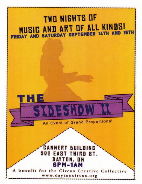
The Sideshow II !

Monday, August 27, 2007
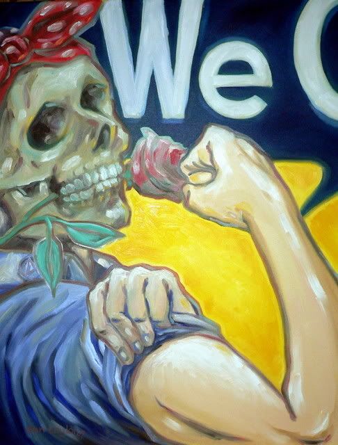
Rosie Does It
This work may or may not be finished. Originally I had intended to put a tat on Rosie's buff bicep. I had a thunderbolt in mind, like those used on the A-10 thunderbolt anti-tank aircraft. Upon reflection. I believe that the tattoo would not add any meaning or interest to this work. Please respond with your thoughts on this.
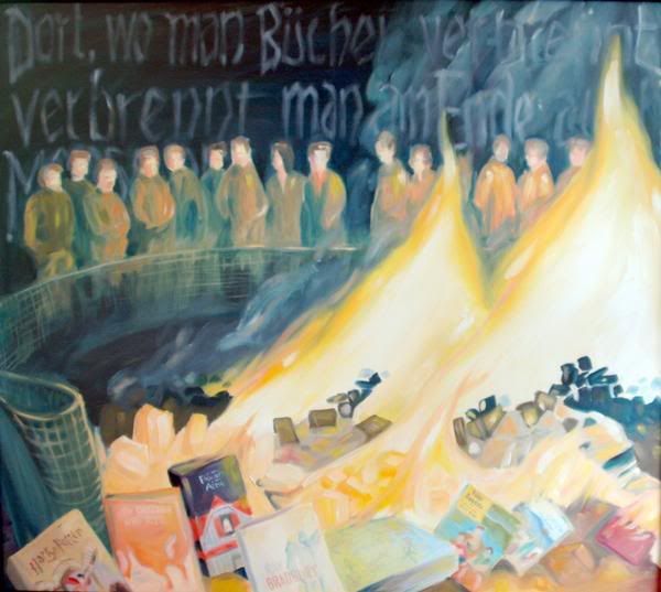
Present Tense
30 x 34 inches
2007
This painting is in response to a photo that I ran across from a news story of a church sponsored book burning. The book burning was not from last century or nazi Germany but from here in the USA and only 3 years ago! I couldn't beleive what I was seeing and I felt the need to further document this event with this painting. The smoky text in the background is in German and roughly translates as: ' when we begin burning books, next we will be burning people'. This line is from a German play from 1821. I find the timeline of this poem, the nazi bookburnings on the 1930's-40's and the book burnings sponsored by today's religeous extremists to be very disturbing. Some of the books featured in the painting are Flowers in the Attic , Grapes of Wrath, Catcher in the Rye, Fahrenheit 451, Harry Potter and the Sorcerer's Stone, Daddy's New Roommate, and Lord of the Flies. All of these books have been banned at one time or another.
Mail Art Entry
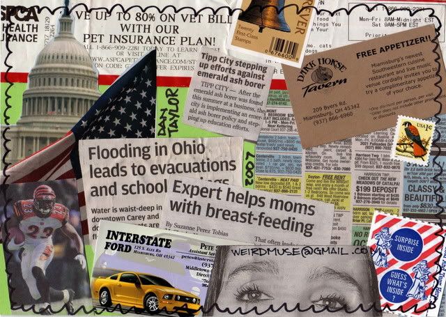
Surprise Inside!
6 x 8 inches
collage on board
2007
This is an entry created for a mail art exhibit at Ripple Cafe in Nottingham, England. Mail Art or Correspondence Art was created by Ray Johnson, a protege of Andy Warhol, in the 1970's. To learn more about Ray's work, check my links under favorite artists.
This piece is meant to say something about the world I live in. From the local to the global. The types of things I would want to know about someone from another continent. Just everyday life type of things that affect the man on the street.
To participate in this project, mail your contribution to:
577 Mansfield Rd.
Sherwood
Nottingham
NG5 2JN
England UK
To view other works in their collection, check our their blog at: www.ripplecafescrapbook.blogspot.com
Sunday, August 26, 2007
Iconoclash
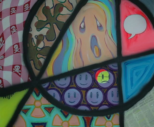
Iconoclash
30 x 40 inches
acrylic, oil pastel, spray paint and collage on canvas
2007
With this piece, I chose to represent a group of iconic images in either unfamiliar or disconcerting ways. The group of smileys with one in cross-hairs of a scoped weapon, the gingham checkerboard tablecloth with poison emblems, a representation of Edvard Munch's painting but in cheery colors. These elements plus the addition of non representational colors and contrasting color blocks are employed to aid in creating a sense of confusion for the viewer. This is further unified by the overlying symbol of the Anarchist 'A' used to frame the elements. This framing is not readily apparent as a design element in it's own right as it is overpowered by the individual elements.
Any comments are welcome and any critiques are greatly appreciated!
